
The Color We Deserve
Every December, Pantone announces its Color of the Year: a single hue chosen to capture the global zeitgeist, reflecting what people are looking for in the year ahead.
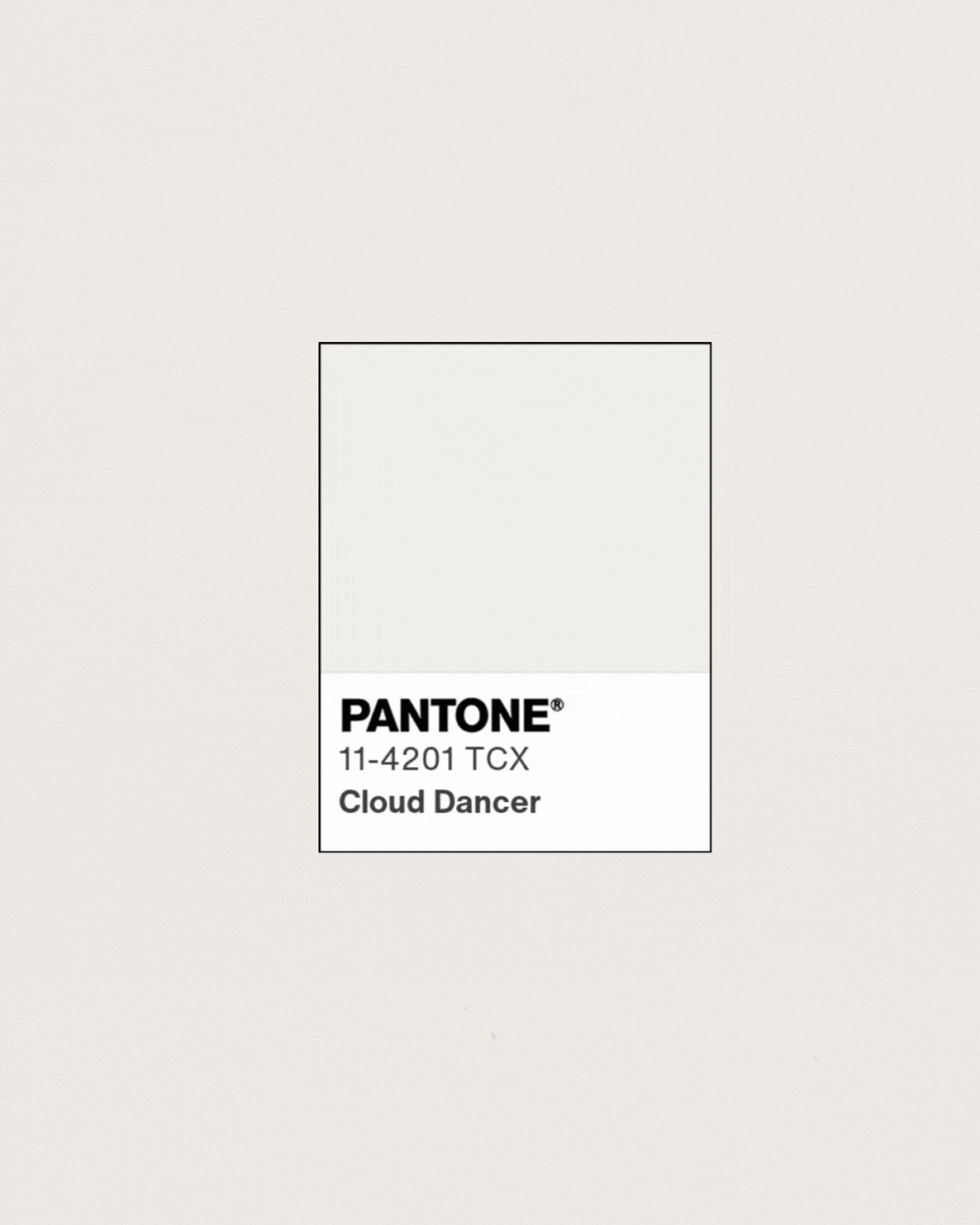
This year, for the first time in the program's history, they chose white.
PANTONE 11-4201 Cloud Dancer. "A lofty white that serves as a symbol of calming influence in a society rediscovering the value of quiet reflection."
And immediately, the debate began. "Is white even a color?" some asked. Others saw it as tone-deaf. Design purists debated the technical merits.
But here's the thing: of course white is a color. Just like black. Just like gray. There are a million different shades of white: each with its own temperature, energy, and way of making other colors sing or recede.
Cloud Dancer isn't absence. It's presence. It's the choice to make space.
And that's precisely what makes choosing just one color so complicated.
Here's my confession: I can't pick one color for the year.
I literally named my brand VidaHue Creative: life and color, because to me, they're the same thing. Color isn't decoration. It's energy. It's how we signal who we are before we say a word.
If I had to answer honestly?
I'd pick the tension. The conversation. The way Cloud Dancer only exists because we know what deep, grounding black looks like: that rich, anchoring presence that holds everything in place. The way bold, saturated, life-giving color only pops when it has space to breathe.s.
That's what I'm watching for this year: not a single shade, but the relationships between them. The balance. The contrast that creates clarity.
Because here's what I've learned working with brands that have outgrown their DIY phase: your brand isn't one color. It's the whole spectrum. It's knowing when to be bold and when to pull back. When to demand attention and when to create space.
The brands that feel most alive aren't monochromatic. They're dynamic. They understand that confidence isn't about being loud everywhere: it's about knowing exactly where your energy belongs.
So maybe my answer isn't Cloud Dancer or deep black or vibrant, saturated color.
Maybe it's the conversation between them. The intentional choice to hold all of it at once: the lightness and the weight, the energy and the calm, the moments that demand to be seen and the foundations that let them shine.
Because the best brands, like the best years, aren't defined by a single moment or mood. They're defined by how well you navigate the full spectrum.
What about you? What if you chose your own color of the year? Not for aesthetics, but as a lens. What shade would help you see what you've been missing?
The year doesn't come pre-colored. We paint it as we go.